
AMAZON KITCHEN // DESIGN SYSTEM
Creative Director
Branding
Design Systems
Photo Art Direction
Art Direction
Digital Design
A persistent challenge amongst Amazon categories is to not come across as merely an algorithm, but rather as the genuine extension of the knowledge a small, passionate internal team for our large customer base. Thus, crafting Amazon Kitchen's branding and marketing direction wasn't merely about brand personality, but also frugality at scale, while continuing to elevate creative expectations.
A persistent challenge amongst Amazon categories is to not come across as merely an algorithm, but rather as the genuine extension of the knowledge a small, passionate internal team for our large customer base. Thus, crafting Amazon Kitchen's branding and marketing direction wasn't merely about brand personality, but also frugality at scale, while continuing to elevate creative expectations.
Photography
Greg Montijo, Mike Nelson
Photo Art Direction
Mckayla Falecki, Antonia Richmond, Christine Wingate, Katie Shafer, Claire Moyle
Styling
Cassandra LaValle, Aran Goyoaga,
Design
Sarah Jensen, Mckayla Falecki, Katie Shafer, Claire Moyle, Sam Bae
Copywriting
Antonia Richmond, Jess Chamberlain, Alison Holm
01 // BRANDING
CHALLENGE
Amazon product often feels like it was presented by a machine algorithm, rather than a curated, friendly hand.
Amazon product often feels like it was presented by a machine algorithm, rather than a curated, friendly hand.
Amazon product often feels like it was presented by a machine algorithm, rather than a curated, friendly hand.
Amazon product often feels like it was presented by a machine algorithm, rather than a curated, friendly hand.
SOLUTION
Present the human, approachable side of Amazon Kitchen, through positioning and strategy as well as visual cues.
Present the human, approachable side of Amazon Kitchen, through positioning and strategy as well as visual cues.
Present the human, approachable side of Amazon Kitchen, through positioning and strategy as well as visual cues.
Present the human, approachable side of Amazon Kitchen, through positioning and strategy as well as visual cues.
POSITIONING AND STRATEGY
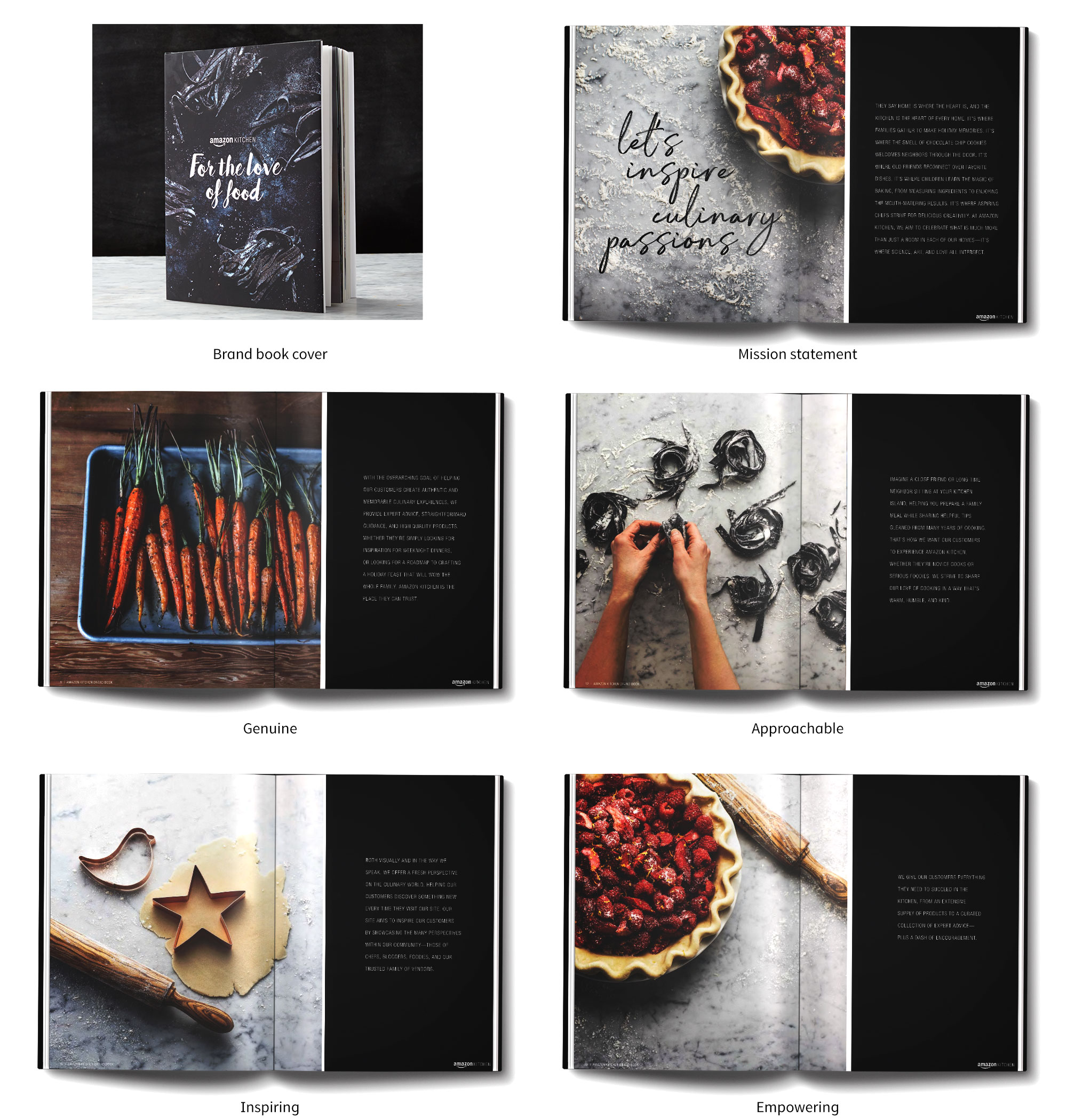
Before focusing on creative, defining core marketing values establishes the direction of Amazon Kitchen. After opening with an emphasis on the warm and inviting character of a kitchen ("They say home is where the heart is, and the kitchen is the heart of every home. It's where the smell of chocolate chip cookies welcomes neighbors through the door. It's where old friends reconnect over favorite dishes. . ."), the 4 key values help inform tone of voice, design, materials, and photography.
VISUAL CUES
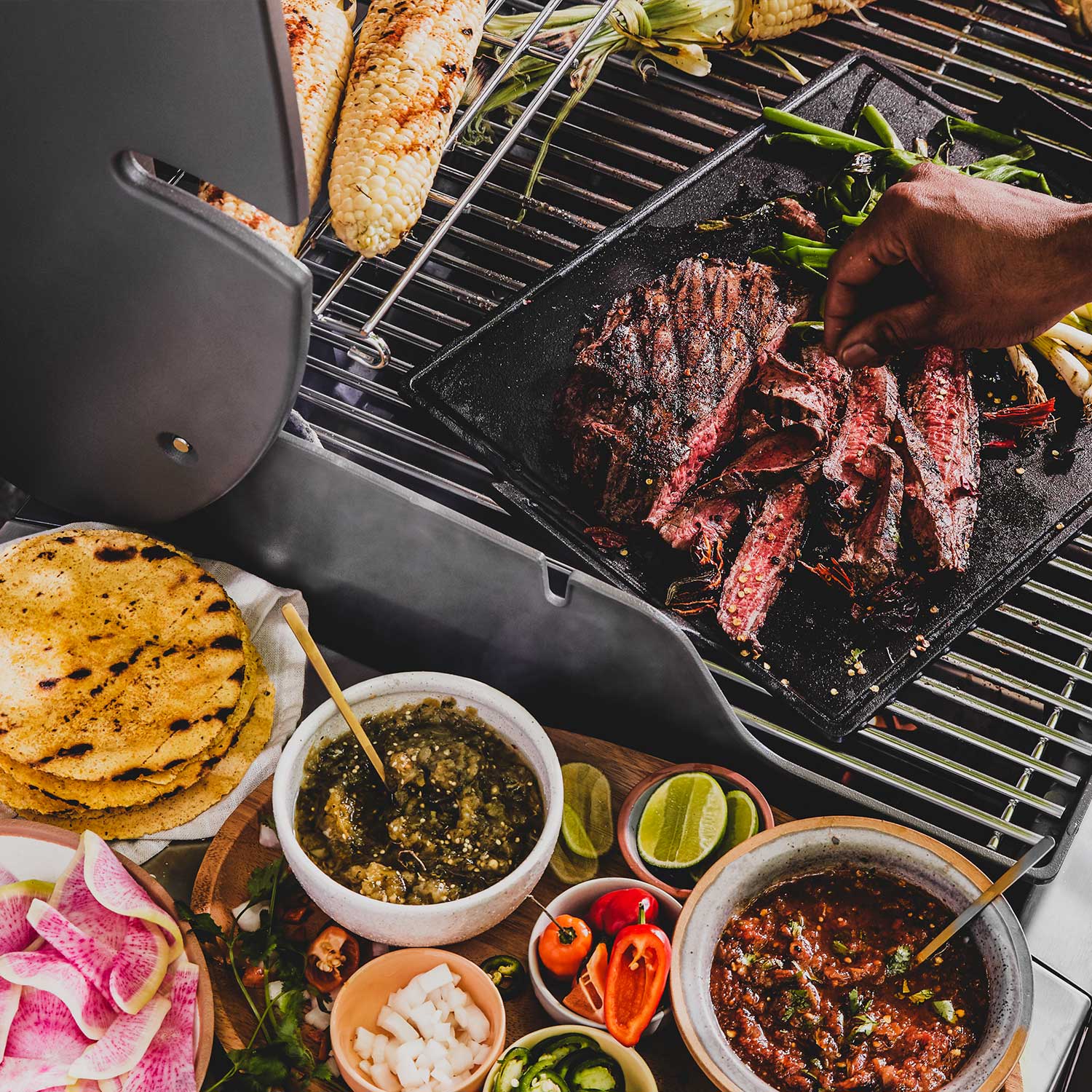
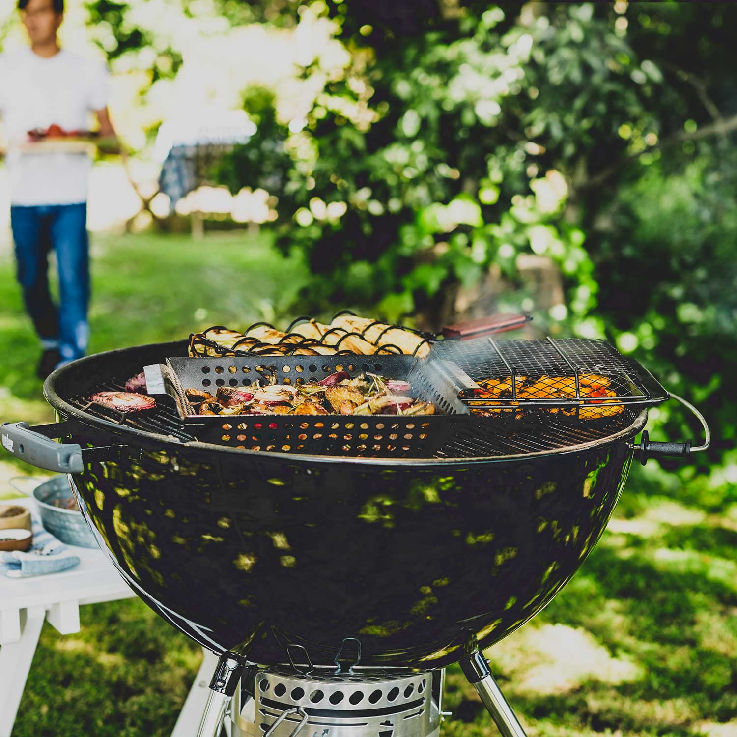
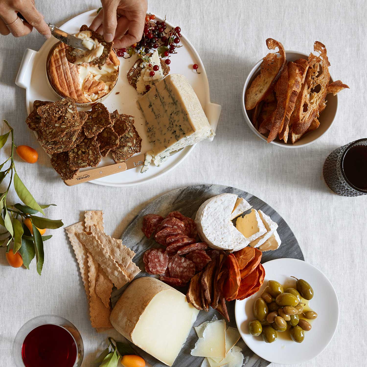
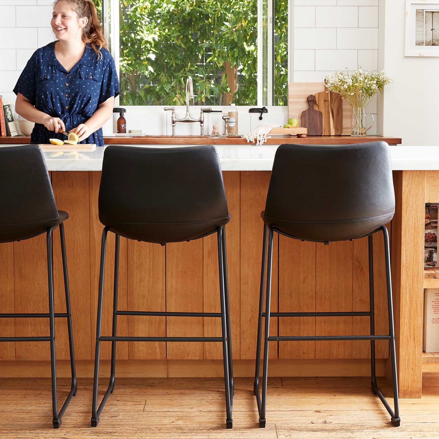
Taken together, Kitchen's values spoke to being warm and welcoming, to presenting a human side of Amazon Kitchen. Bringing this direction to life meant: allowing crumbles and imperfections to make their way onto and around product that was genuinely in use; showing chef's hands crafting dishes; using "natural" lighting, as if in a neighborhood kitchen; camera angles and technique (such as rotated cameras, elements in foreground, gatherings in background) that feel spontaneous, rather than planned; using a "hand-written" type that nodded at the human touch; as well as sketch style illustrations. Additionally, we partnered with known chefs and influencers to present real, achievable recipes.
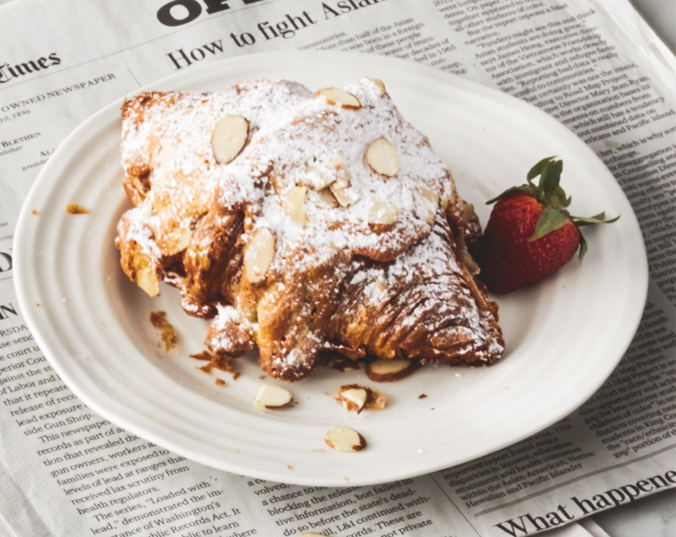
Product styling
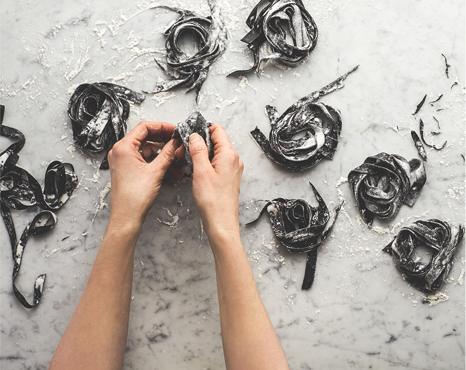
Hands in shots

"Morning light" natural lighting

Editorial style camera angles
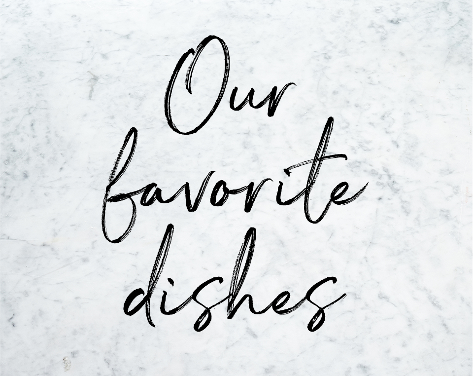
"Handwritten" titles and headlines
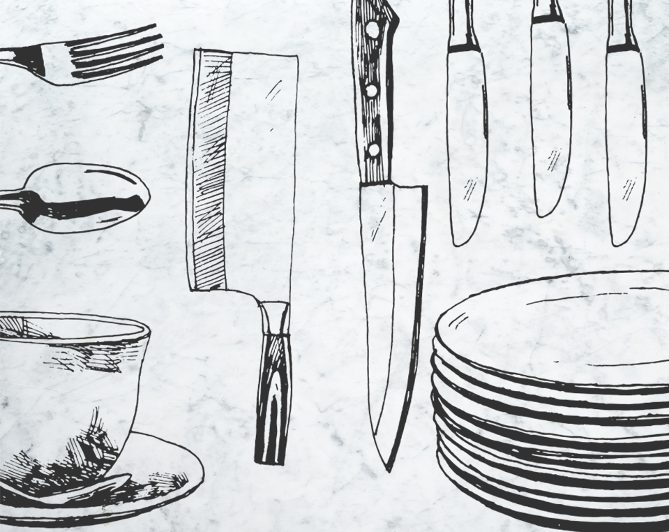
Hand-drawn illustration style
02 // DESIGN SYSTEM
CHALLENGE
Kitchen began as a category with a small editorial crew, and a frugal budget. How can we create a great experience at scale?
Kitchen began as a category with a small editorial crew, and a frugal budget. How can we create a great experience at scale?
Kitchen began as a category with a small editorial crew, and a frugal budget. How can we create a great experience at scale?
Kitchen began as a category with a small editorial crew, and a frugal budget. How can we create a great experience at scale?
SOLUTION
Craft a kit-of-parts material pallete and emphasize the halo effect of first impressions to scale the brand with frugality.
Craft a kit-of-parts material pallete and emphasize the halo effect of first impressions,
Craft a kit-of-parts material pallete and emphasize the halo effect of first impressions to scale the brand with frugality.
Craft a kit-of-parts material pallete and emphasize the halo effect of first impressions to scale the brand with frugality.
HALO EFFECT
Successful design systems begin with a core truth—for Amazon Kitchen the power of a strong first impression colored the remainder of a customer's interaction. The buzz of a Ace Hotel's lobbies (in contrast to the minimalist rooms) and the storytelling of James Perse lease lines (in contrast to tastefully spartan store interiors) inspired the approach. These references drove internal buy-in through a visual understanding of the strategic implementation, wherein investment in editorial-style content provided a halo effect that allowed for a simplified system of interchangeable materials and layouts to inform the rest of the customer journey.

HOSPITALITY - ACE HOTEL
Ace Hotel lobbies are vibes, inviting visitors to hang in sprawling conversational areas. The uniqueness of the lobby experience counterbalances the tight quarters of the individual rooms.
HOSPITALITY - ACE HOTEL
Ace Hotel lobbies are vibes, inviting visitors to hang in sprawling conversational areas. The uniqueness of the lobby experience counterbalances the tight quarters of the individual rooms.
HOSPITALITY - ACE HOTEL
Ace Hotel lobbies are vibes, inviting visitors to hang in sprawling conversational areas. The uniqueness of the lobby experience counterbalances the tight quarters of the individual rooms.

PHYSICAL RETAIL - JAMES PERSE
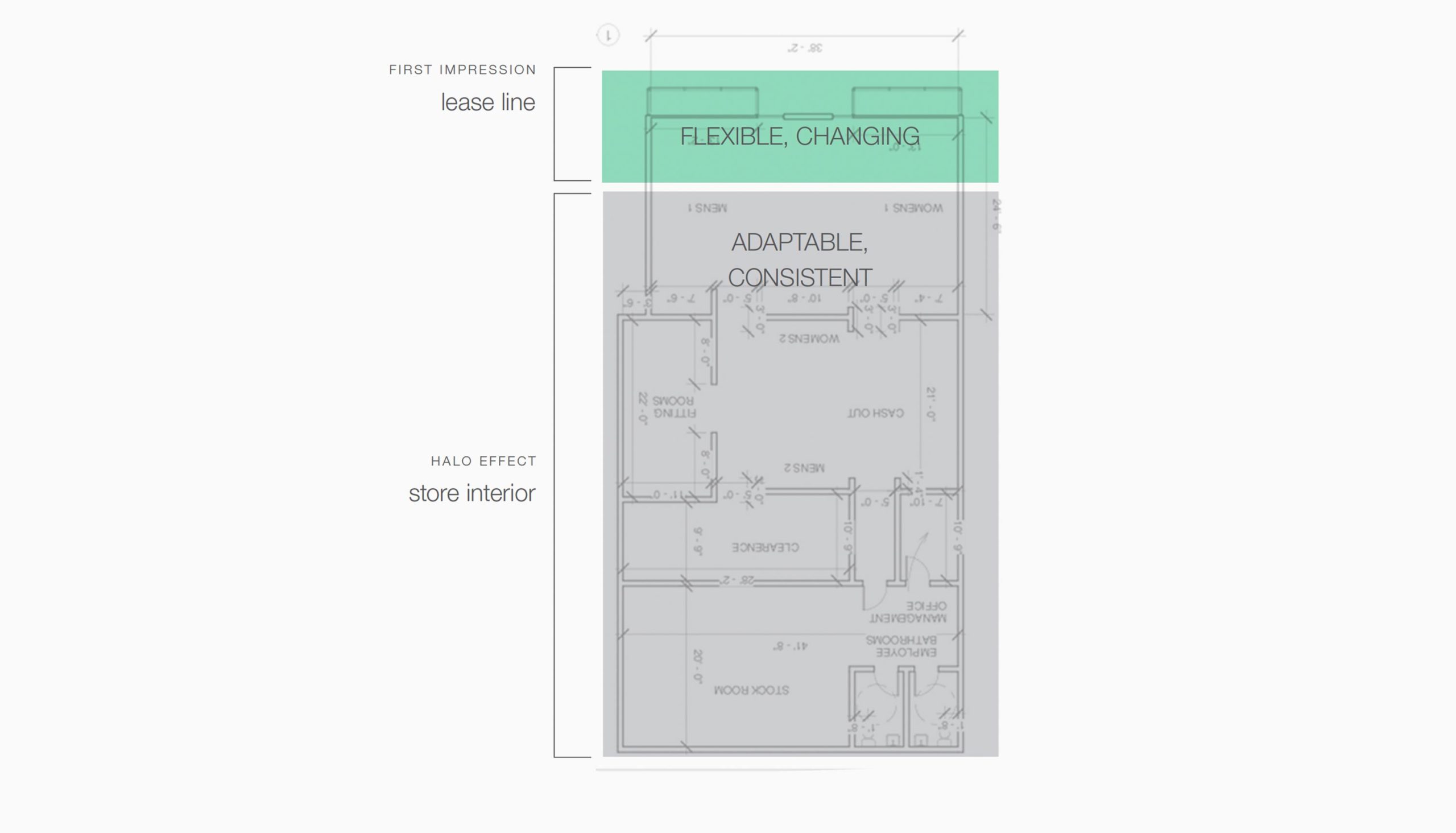
In contrast to engaging seasonal lease-line installations, store interiors are composed with a simple palette of core materials; allowing product to be focal, regardless of color or style.
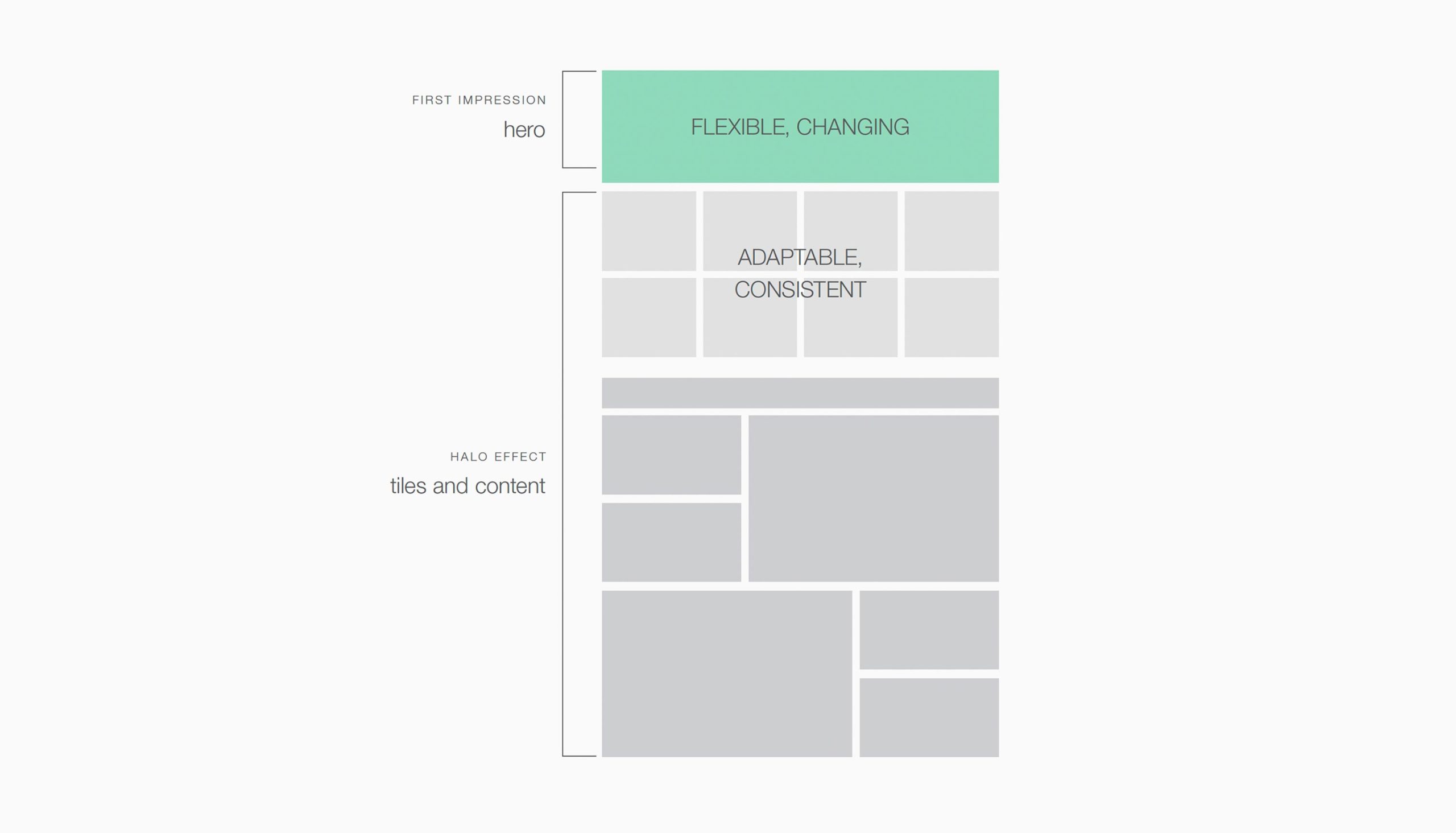
RETAIL STORE / UX DESIGN
As the first impression in a retail store is the lease line, so too the first impression on-line is the header. Developing strong evergreen elements lower on the page allows for an investment on the initial impression.
MATERIAL PALETTE
A tight edit of materials means less pre-production and development, longer evergreen content usage, and reinforces brand recognition. To insure scale, a palette calendar uses the same core of materials through different combinations.
MATERIAL PALETTE
A tight edit of materials means less pre-production and development, longer evergreen conten usage, and reinforces brand recognition. To insure scale, a palette calendar uses the same core of materials through different combinations.
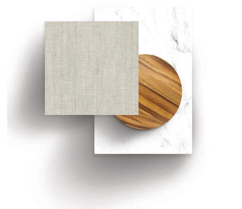
SPRING / SUMMER PALETTE - marble. burnished wood, linen
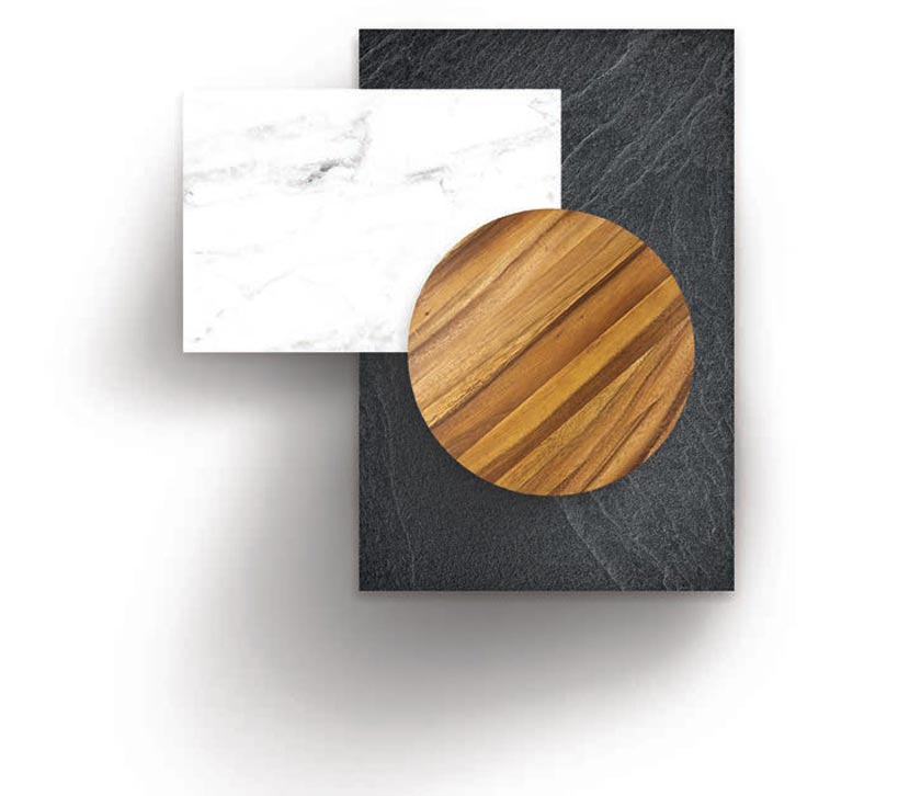
FALL/WINTER PALETTE - slate, marble. burnished wood
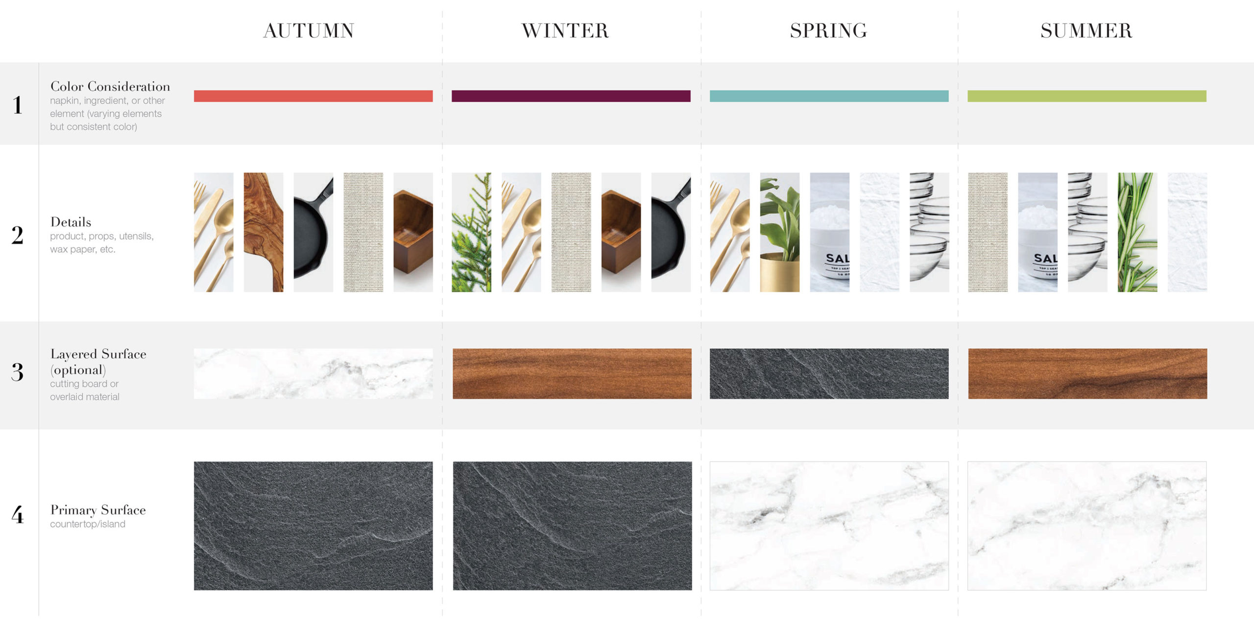
PALETTE CALENDAR
With a seasonal base surface stretching through seasons, the second-layer surface option helps supplement additional design elements—and if one placement remains beyond it's initial timeline the system flexibility.
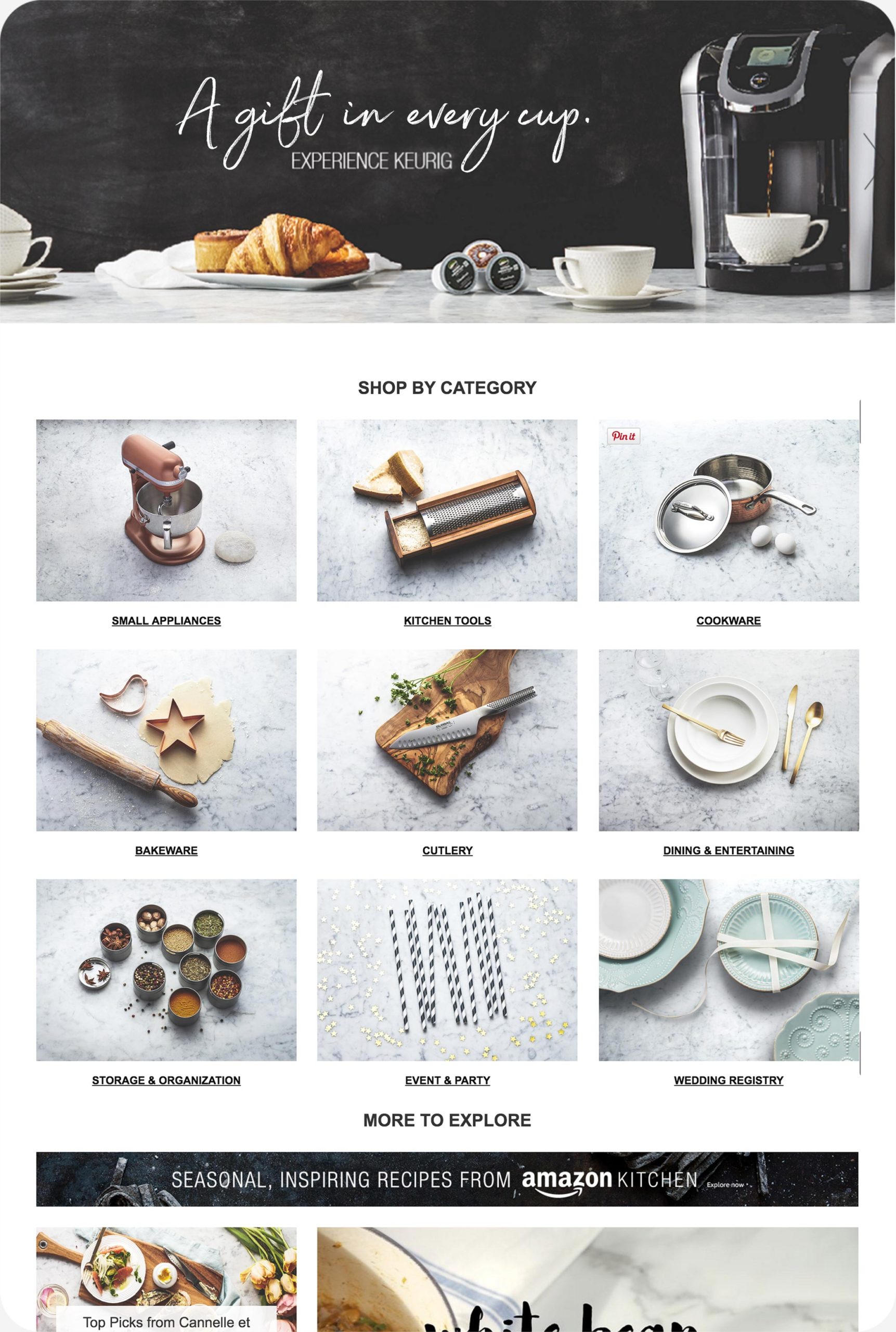
LANDING PAGE EXAMPLE
03 // CAMPAIGN IMAGERY
CHALLENGE
Elevate the perception of Amazon Kitchen's assortment, and make the category a first-visit for customers, rather than a price check.
Elevate the perception of Amazon Kitchen's assortment, and make the category a first-visit for customers, rather than a price check.
Elevate the perception of Amazon Kitchen's assortment, and make the category a first-visit for customers, rather than a price check.
Elevate the perception of Amazon Kitchen's assortment, and make the category a first-visit for customers, rather than a price check.
SOLUTION
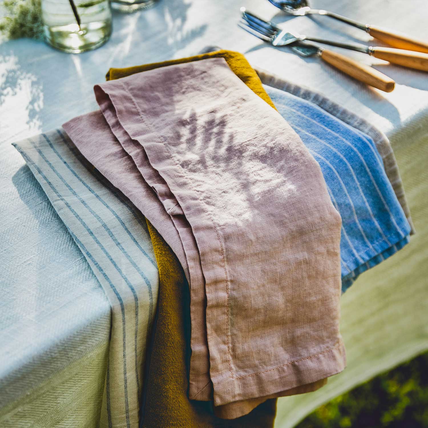
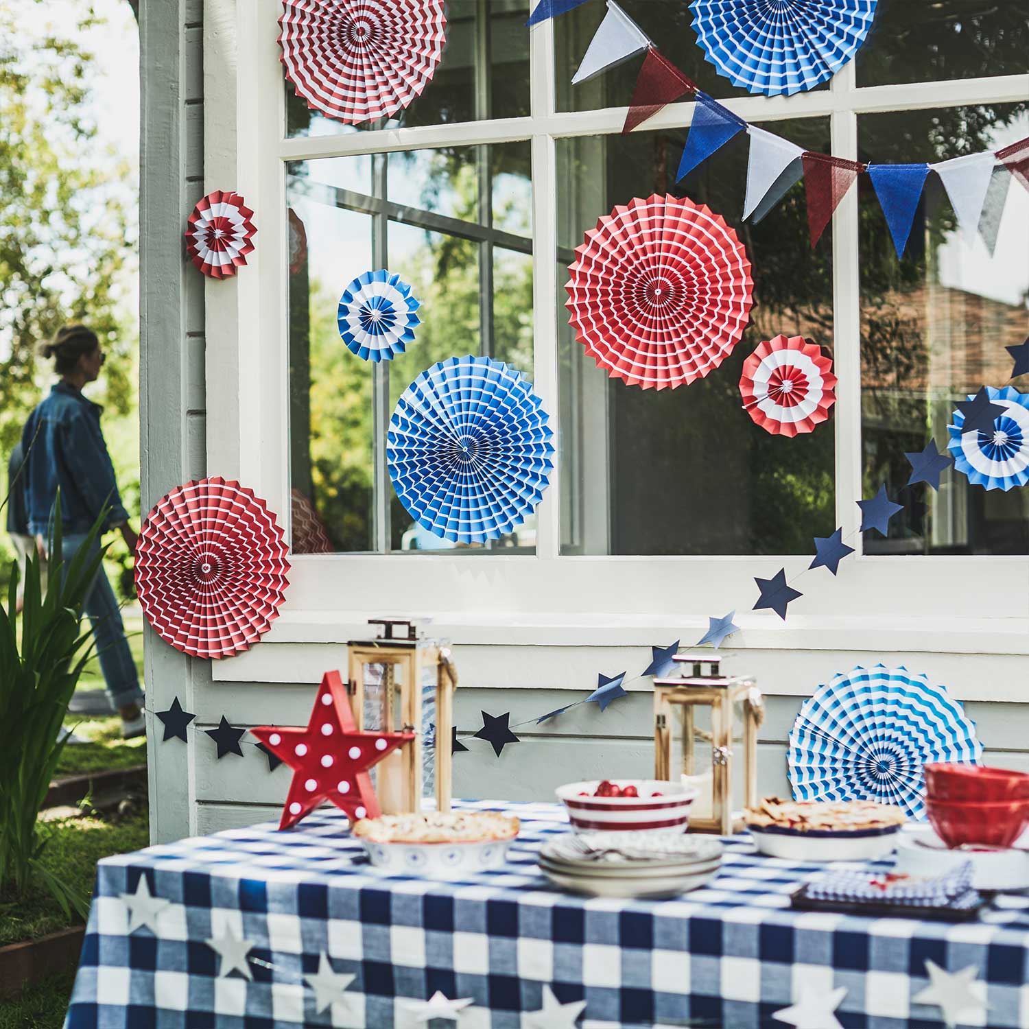
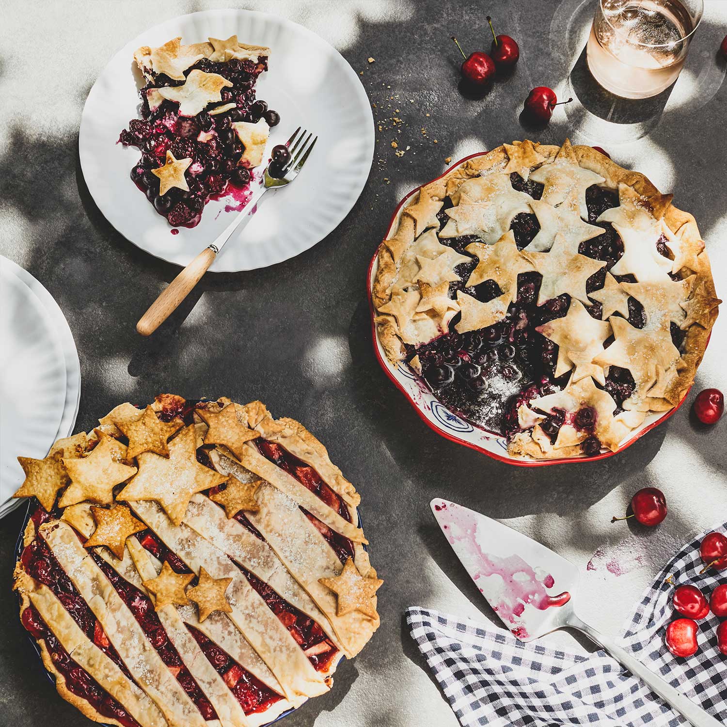
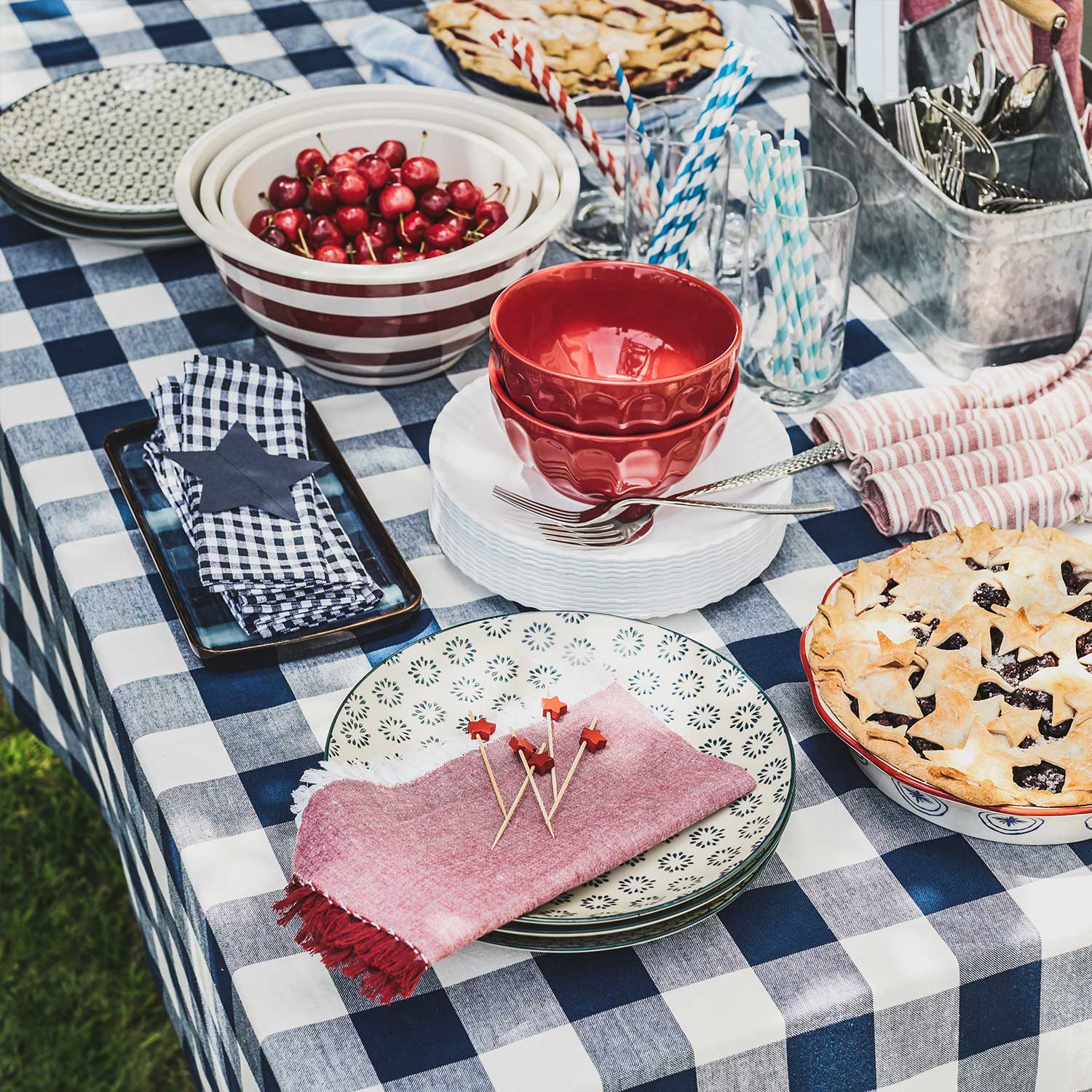
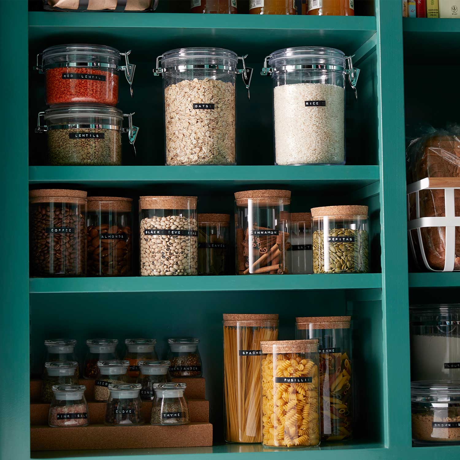
Using the established visual cues, delve into a variety of occasions and lifestyle editorial stories.
Using the established visual cues, delve into a variety of occasions and lifestyle editorial stories.
Using the established visual cues, delve into a variety of occasions and lifestyle editorial stories.
Using the established visual cues, delve into a variety of occasions and lifestyle editorial stories.



PROJECTS
© 2024 MARCELLUS NEEL
All rights reserved.

